
The Dividend School Philosophy
How I invest for income, and why the index isn’t the answer anymore.

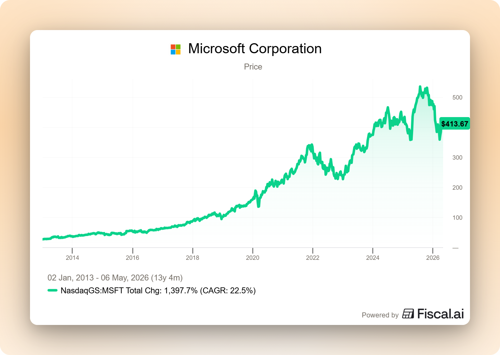
In 2013, I bought my first dividend stock. It was Microsoft.
I still remember the feeling when the first dividend hit my brokerage account a few weeks later. I hadn’t sold anything. I hadn’t done anything. The business I owned a tiny piece of had earned a profit, and they sent me my share of it.
That moment changed how I thought about investing. For the first time, the stock market stopped looking like a casino and started looking like a portfolio of real businesses. I owned a small piece of a real company. They had real customers, real products, real cash flow, and they were sharing a slice of it with me.
I’ve been investing this way for thirteen years. Through 2018. Through the 2020 pandemic. Through the 2022 bear market. Through every cycle in between. And along the way, I started writing publicly, because I kept seeing the same two mistakes destroy ordinary investors.
The first group chased yield. They saw a 9% payout, bought without a second thought, and watched the dividend get cut and the stock cratered. They swore off dividend investing forever.
The second group skipped dividends entirely. They piled into growth stocks chasing the next 10-bagger, watched half their portfolio disappear in a downturn, and panic-sold at the bottom.
Both outcomes were avoidable. The framework that prevents both is simple enough to teach in an afternoon. But almost no one teaches it, because almost every investing service is selling something else: stock picks, hot tips, “how to beat the S&P.” Stock picks are easy to package. Frameworks are not.
This article is the framework.
This is what I do, what I believe, and how I do it. If you’ve spent any time on Dividend School, this is the foundation on which everything else is built. Pin it. Reread it. Send it to a friend who keeps asking why you don’t just buy the index.
Because the index is exactly where I want to start.
The S&P 500 isn’t the answer for income. Not anymore.
Here’s a number worth sitting with for a second.
1.10%.
That’s the dividend yield on the S&P 500 today. It’s the lowest yield in modern history. Lower than 2000, lower than 2007, lower than any reading since the index has been tracked.
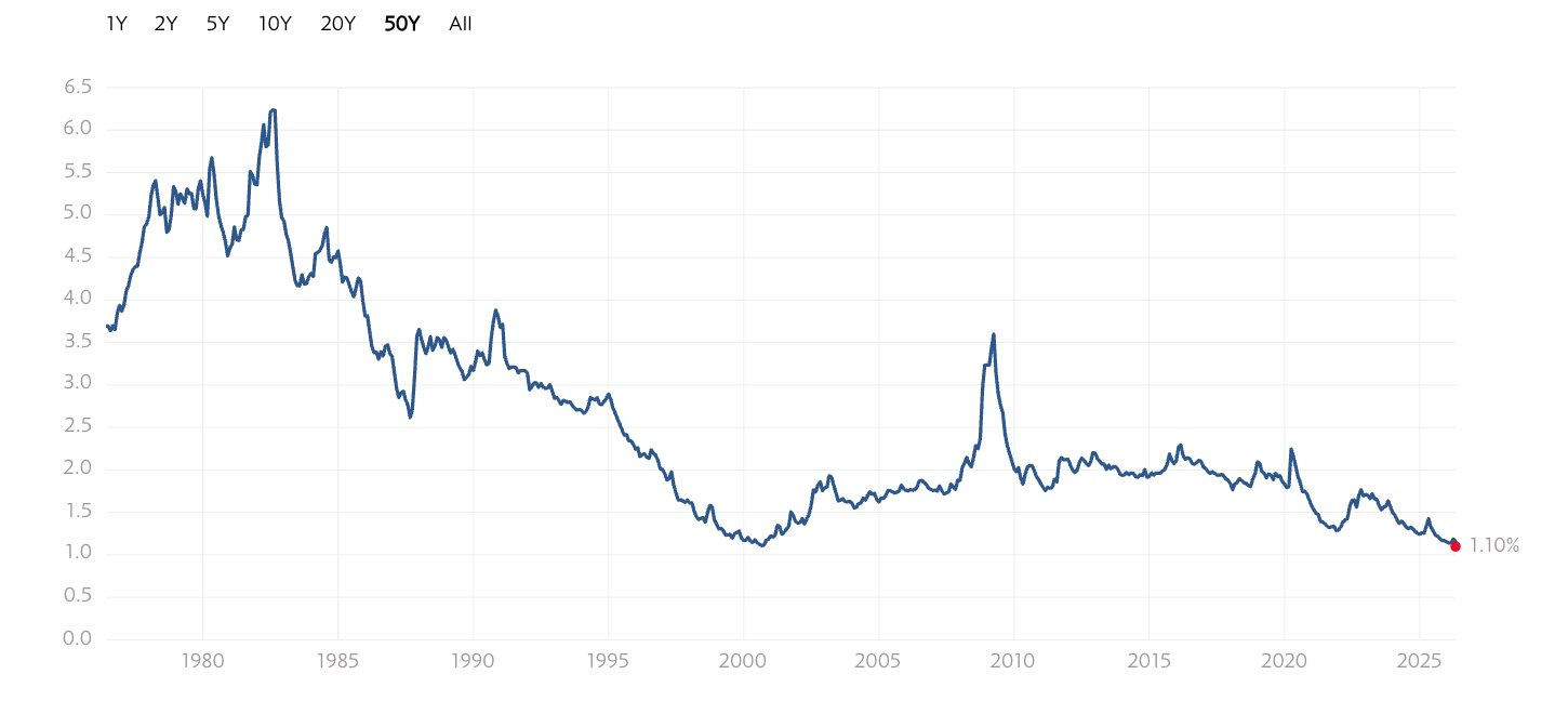
The reason isn’t a mystery. The Magnificent Seven dominate the index now. Apple, Microsoft, Nvidia, Amazon, Meta, Alphabet, Tesla. Most of them pay tiny dividends or nothing at all. They’ve quietly rewired the S&P 500 from a diversified basket of American businesses into a concentrated growth bet dressed up as a diversified portfolio.
If your goal is income (replacing a paycheck someday, funding retirement, generating cash you can spend), the index is no longer the right tool for the job. Not at 1.10%. You’d need a $5 million S&P portfolio to generate $55,000 of pre-tax income a year. That’s not a retirement plan. That’s a problem.
But here’s the half of the story most investors miss.
The total dividend paid by S&P 500 companies has grown from roughly $22 per share in 1980 to roughly $80 per share today. Through the 1987 crash. Through the dot-com bust. Through 2008. Through the 2020 pandemic. Dividends got paid in good times and bad. They got paid when CNBC was screaming about the next recession. They got paid when nobody was watching.
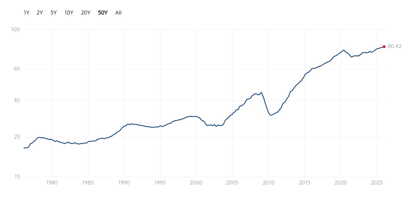
Stock prices are volatile. The dividends paid by great companies are not.
That’s the lesson hidden in the chart. The headline yield is at an all-time low because prices have run faster than payouts. But the underlying cash flowing out of these businesses has grown for forty straight years. The income machine is still humming. You just can’t access it cleanly through an index anymore.
You have to build it yourself. One business at a time.
Beating the market doesn’t matter. Funding your life does.
I want to reframe what success looks like, because most investors are keeping score wrong.
Almost every investing newsletter, podcast, and YouTube channel is selling the same thing: how to beat the S&P 500. My portfolio vs. the index. Returns this quarter vs. the benchmark. Did you outperform? It’s everywhere.
But that scoreboard belongs to fund managers. Not you.
A fund manager who beats the index by 5% in a 30% drawdown still gets his bonus. He still keeps his job. He still pays his mortgage. You don’t. If your portfolio is down 25% the year you planned to retire, outperforming doesn’t pay your property tax bill.
You’re not a money manager. You’re a person trying to fund a life.
That’s why the scoreboard I care about is different. I care about the dividend checks landing in my account. I care about whether they’re growing faster than inflation. I care about whether they show up in good years and bad. I care about whether, five, ten, or twenty years from now, those checks can replace my paycheck without me ever having to sell a share.
That’s the income machine.
You build a portfolio of high-quality businesses that pay you to hold them. You reinvest the dividends until you need the cash. You let the income compound quietly through every cycle. Once it’s built, it runs. You don’t have to time the market. You don’t have to predict the next recession. You don’t have to outsmart anybody. You just have to own great businesses and let them work.
When that’s the goal, beating the index becomes a footnote. Some years you will. Some years you won’t. It doesn’t matter. That’s not the game you’re playing.
Business first. Dividend last.
This is the core of what I teach, so I want to be very clear about it.
Most dividend services lead with yield. I lead with the business.
When I’m researching a stock, the dividend is the last thing I evaluate. Not the first. The dividend is an output. It’s what falls out of a great business, not a reason to buy a mediocre one.
Every stock I’d consider for the universe goes through six tests before the dividend even comes up:
The business. What do they sell? How do they make money? Will the model still work in twenty years?
The moat. What protects them from competition? Pricing power, network effects, switching costs, scale, brand?
Management. Are they good operators? Are they aligned with shareholders? Do they have skin in the game?
Growth. Where is revenue going? Is the runway real, or are they running out of room?
Risk. What could break the thesis? What are the downsides if I’m wrong?
Valuation. What’s a fair price to pay today?
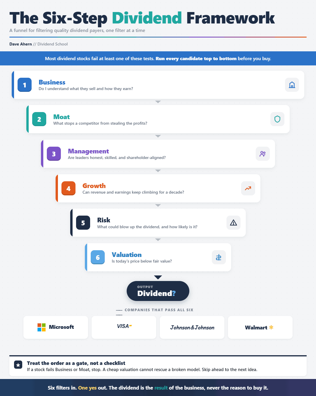
Only after a company passes those tests does the dividend question come up. Is it safe? Is it growing? Is it higher than the index’s 1.10%? Will it grow faster than inflation?
If the answer is yes, the stock earns a place in the universe.
If the answer is no, even if the yield is jaw-dropping, it doesn’t.
This is why my members don’t get caught in yield traps. A 9% yielder almost always fails the business test or the moat test long before the dividend question is even on the table. Boeing was paying out billions in dividends right up until the 737 MAX was grounded. AT&T raised the dividend for thirty-five years before slashing it in 2022. Kraft Heinz looked like a textbook dividend stock until it cut its payout almost in half in 2019.
The dividend wasn’t the warning sign in any of those cases. The business was. And the framework would have flagged it.
Let me walk through each step.
1. The business
Before I look at a single number, I want to answer one question in plain English: what does this company actually do?
If I can’t explain the business to a friend at dinner without jargon, I’m not buying it. That’s not me being lazy. That’s me being honest about what I understand.
Coca-Cola sells flavored sugar water in roughly two hundred countries, and they’ve been doing it for more than a century. McDonald’s sells food and rents real estate to franchisees. Visa runs the rails that almost every credit card transaction in the developed world depends on. Costco sells memberships that give people the right to buy groceries at very low margins.
These are simple businesses. That’s the point.
What I want is durability. A model that works the same way in good economies and bad. Consumers will keep brushing their teeth (Procter & Gamble, Colgate). They’ll keep paying their utility bills (NextEra, Duke Energy). They’ll keep getting sick and needing medicine (Johnson & Johnson, AbbVie). They’ll keep swiping cards (Visa, Mastercard).
I want boring. Boring compounds.
If I can’t articulate why a business will still be earning money in twenty years, I move on. There are thousands of publicly traded companies in the U.S. alone. I don’t need to figure them all out.
2. The moat
A moat is whatever protects a company from competition. Without one, profits get competed away. With one, profits compound.
Buffett’s mental model is the right one: imagine the business as a castle. The moat is what keeps the castle from getting raided.
The strongest moats I’ll pay up for:
Network effects. Visa and Mastercard are valuable because they are widely accepted. Everyone uses them because they’re valuable. The more merchants accept cards, the more cardholders sign up; the more cardholders, the more merchants accept cards. New entrants can’t catch up.
Switching costs. Microsoft is embedded in every enterprise on earth. Try switching your company off Excel, Outlook, and Teams and see how long it takes. Same with ADP. Once you’ve outsourced payroll, you don’t switch providers for a 5% discount.
Brand and pricing power. Coca-Cola can raise prices every year, and people still buy it. Hermès can charge $15,000 for a handbag because it’s a Hermès. That’s a moat measured in mindshare.
Scale and cost advantage. Costco buys at a lower per-unit cost than anyone else and passes the savings to members. Walmart’s distribution network can’t be replicated without a hundred billion dollars and twenty years.
If a business has a moat, it can raise its dividend for decades without earnings collapsing, because earnings are protected. If it doesn’t, the dividend is on borrowed time, and you’re just renting yield.
3. Management
A great business with bad management is a slowly leaking bucket.
I want to know who’s running the show, how they’re paid, and whether they own the stock themselves. The cleanest signal is alignment. When management is paid in stock, personally owns a meaningful stake, and is compensated based on long-term metrics rather than this year’s EPS, their incentives line up with mine.
Family-controlled and founder-led businesses tend to outperform on this dimension because the family’s net worth lives or dies with the company. Brown-Forman (Jack Daniel’s), Hershey, Walmart, and Cintas have all delivered for shareholders for decades, in part because the families running them think in generations, not quarters.
Capital allocation is the other thing I’m watching. When the company earns a dollar of free cash flow, what do they do with it? The best CEOs reinvest where returns are high, buy back stock when shares are cheap, pay a sustainable, growing dividend, and acquire other businesses only when the math actually works. The worst CEOs build empires.
Read the proxy statements. Read the shareholder letters. Listen to the earnings calls. You can tell within an hour whether management is thinking about the company or thinking about their stock options.
4. Growth
A dividend can only grow if earnings grow. Earnings can only grow reliably if the business is growing. Please let me know where the next decade’s revenue will come from.
I’m not looking for hypergrowth. A 5-8% organic revenue grower with a strong moat is exactly what I want. That’s enough to support a dividend that grows faster than inflation, with room left over for buybacks and reinvestment.
The companies I love most are the ones with secular tailwinds.
Aging demographics is a thirty-year tailwind for healthcare names like Johnson & Johnson, UnitedHealth, and Stryker. The global migration from cash to digital still has decades to run for Visa and Mastercard. Cloud and software adoption are still in the early innings in industries like manufacturing and logistics, which works in Microsoft’s favor. The buildout of physical data infrastructure benefits companies like American Tower and Crown Castle.
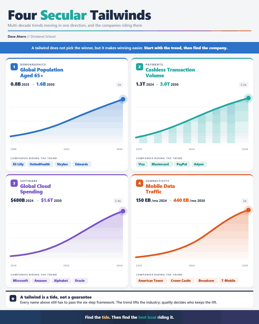
The trend doesn’t have to be glamorous. Watts Water makes plumbing fittings. Roper Technologies acquires niche software companies. Sherwin-Williams sells paint. Boring is fine. Growing is essential.
If a company can’t tell me where growth comes from over the next decade, I can’t tell myself why its dividend will be larger than it is now. That’s a pass.
5. Risk
Every thesis has a way of breaking. My job is to find it before I buy.
I ask the same questions for every name. Is the balance sheet healthy? I want low debt relative to earnings, ample free cash flow coverage, and, in most cases, an investment-grade credit rating. Companies that leverage up to fund the dividend are the ones that get caught when the cycle turns. Is the dividend safe? I look at the payout ratio against earnings and free cash flow. A 90% payout ratio is a yellow flag. A 110% payout ratio is a cut waiting to happen.
What does a recession do to the business? Some companies barely notice: Procter & Gamble, Colgate, Coca-Cola. Some get devastated: anything tied to housing, autos, or discretionary capex. I want to know the answer before the recession arrives, not during it.
What’s the regulatory exposure? Healthcare, banking, and utilities live and die by regulation. That doesn’t disqualify them (UnitedHealth and JPMorgan are exceptional businesses), but the risk has to be priced in.
What’s the technology risk? Will AI replace this business? Will a new platform make this product obsolete? Some businesses are technology-immune. Others are technology-fragile. I size my positions accordingly.
The point isn’t to find a stock with no risks. There’s no such thing. The point is to know what you’re buying and to size the position so you can survive being wrong.
6. Valuation
You can buy a great business and still get a bad investment if you pay too much.
I’m not a deep-value investor. I’m not waiting for Coca-Cola to trade at 8x earnings. That’s never going to happen, and even if it did, something would be very wrong. But I’m not paying any price either. I want a fair price for a wonderful business. That’s Buffett’s line, and it’s mine.
I use a variety of tools, depending on the company, but my main process includes:
Discounted Cash Flow (DCF)
Reverse DCF
Relative metrics (P/E, P/FCF, EV/EBITDA, etc.)
I look at a company’s own history first. If a stock has averaged 22x earnings over the last decade, paying 30x today means I’m betting on multiple expansion. That’s a bad bet over the long run. I’d rather pay 18x and let multiple expansion be a free option.
I cross-check with free cash flow yield, dividend yield relative to its historical range, and a rough discounted cash flow analysis under conservative assumptions. None of these is precise. They don’t need to be. I’m looking for a stock where I’d be happy with the return, even if the multiple never expanded, where the cash flows alone do the work.
Don’t focus on precision; focus on ranges. It’s not important to determine whether Coke is worth $43.46 or $44.02. It’s far more important to determine if Coke is worth between $40-$50. Because in the long run, the small differences in value won’t matter.
When valuation lines up with everything else, I buy. When it doesn’t, I wait. There’s always another fat pitch. Patience is a free skill. Use it.
Then, and only then, the dividend question
Once a company has cleared all six tests, I finally look at the dividend itself.
I want a yield meaningfully above the index (at 1.10%, that bar is low), but not so high that it’s signaling distress. I want a payout ratio under 75% on free cash flow. I want a dividend that’s been growing consistently, ideally for at least a decade, through at least one recession. I want the growth rate to clear inflation by a comfortable margin.
If all of that is true, the stock makes the universe.
That’s it. That’s the framework.
Shareholder yield: the part most dividend investors miss
I want to add one more layer, because it doubles the power of the strategy.
When a great company earns more cash than it can profitably reinvest, it returns the excess to shareholders. There are two ways to do this: dividends and buybacks. Most dividend investors only count the first one. They’re missing half the picture.
A buyback is, mathematically, a tax-deferred dividend. When a company retires shares, every remaining shareholder owns a slightly larger slice of the business. Earnings per share goes up. Dividends per share goes up. Your ownership goes up. And you didn’t pay a penny of tax on the increase.
Apple is the cleanest example of the last decade. They’ve bought back roughly a quarter of their outstanding shares since 2013. Shareholders who held the entire time saw their ownership of Apple grow by a third without lifting a finger.
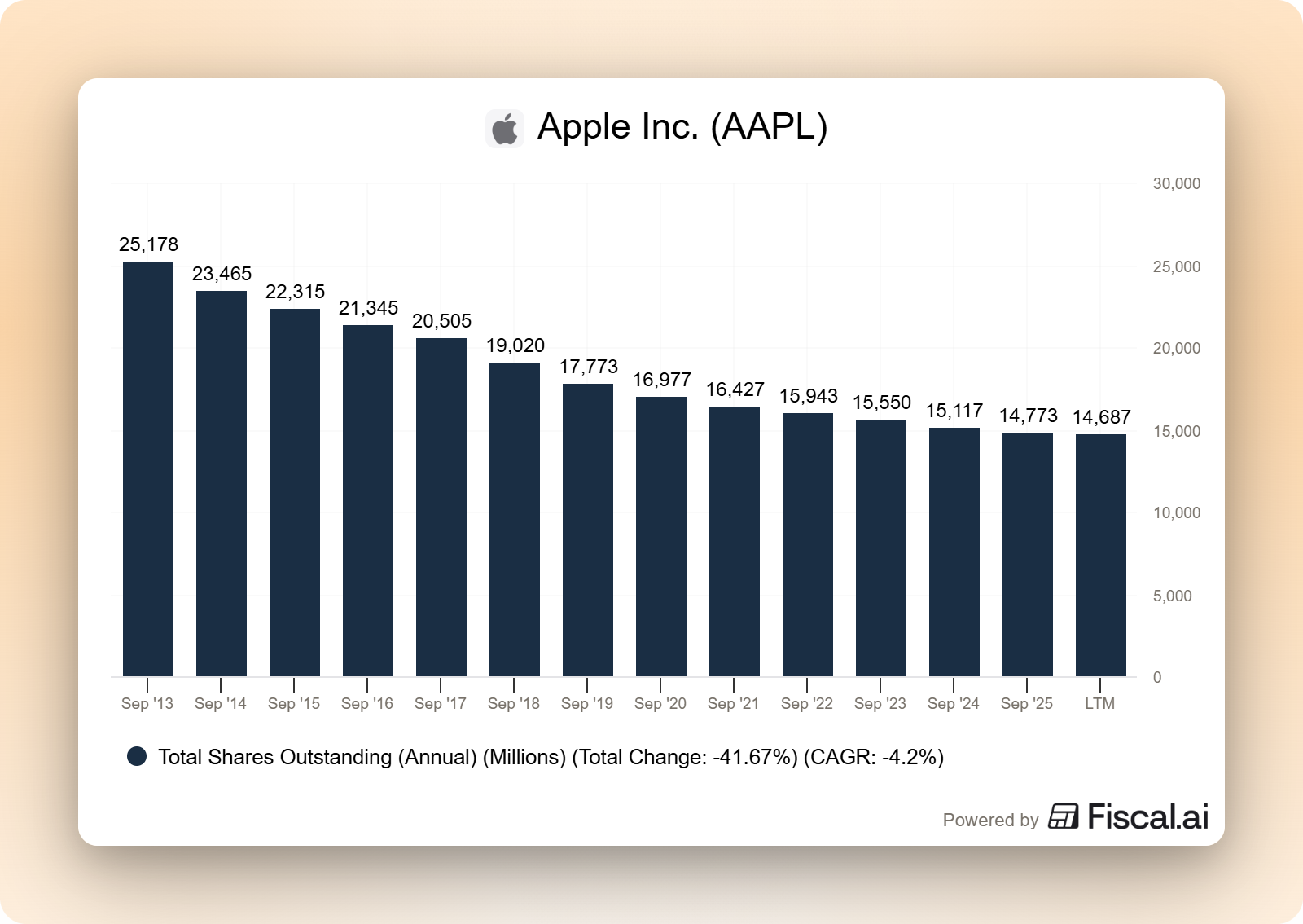
Shareholder yield = dividend yield + buyback yield. That’s the metric I actually track.
It also opens up a tier of great businesses that don’t show up on dividend screens (companies like Visa, Mastercard, and AutoZone) that return enormous amounts of capital to shareholders, just not primarily through dividends. If a business passes the six tests and the total capital return is strong, it’s a candidate. The form of the return matters less than the fact of it.
Who this works for
This isn’t for everyone, and I’d rather be honest about that than pretend it is.
This works if you want to own great businesses, not chase yields. If you’d rather sleep through a bear market than try to time it. If you want income that grows year after year, not the next 10-bagger. If you believe compounding works when you give it time and discipline.
It doesn’t work if you measure yourself against the S&P 500 every quarter. It doesn’t work if you want stock picks without context. It doesn’t work if you’re flipping for short-term gains. It doesn’t work if you’re hunting yield without caring why the yield is high.
If the first list sounds like you, you’re in the right place. This is exactly what I do.
The point of all of this
I’ve been investing in dividend stocks for thirteen years. I’ve made every mistake in the book at least once. I bought yield traps early on. I sold great companies during drawdowns when I should have held. I held losers too long because I didn’t want to admit I was wrong.
What I’m teaching at Dividend School is the strategy that emerged on the other side of all of that. The one that survived contact with my own mistakes.
It works because it’s simple. Own great businesses. Let them pay you. Reinvest until you need the cash. Don’t trade. Don’t predict. Don’t try to outsmart the market. Just keep adding to the income machine.
The compounding takes care of itself.
If you’ve made it this far, you’re the right kind of investor for this work. Subscribe, follow along, and let’s compound our dividends together.
Dave Ahern, Founder, Dividend School
The 1.10% yield number is the single most powerful argument for active income investing over passive indexing right now, and I think it deserves even more emphasis than you give it here because of what it implies structurally.
When the S&P 500 yields 1.10%, a passive investor needs $5 million to generate $55,000 in pre-tax income. you lay this out clearly. but the deeper implication is that the index has quietly stopped being a diversified portfolio at all. seven companies now represent roughly 35% of the index weight. most of them pay minimal or zero dividends. the remaining 493 companies in the index include dozens of excellent dividend payers, but their weight in the index is so small that their yields are mathematically drowned out by the megacap concentration.
the structural irony is that the dividend investor building a 25-stock portfolio of carefully selected income-paying companies is now better diversified than the index investor who owns "500 companies." because the index investors actual exposure is dominated by seven highly correlated technology names, while the dividend portfolio is genuinely spread across utilities, healthcare, consumer staples, industrials, energy, and financials. conventional wisdom says the index is safer. the maths says the opposite in this specific concentration environment.
Your Microsoft chart from 2013 is doing important work in this piece because it demonstrates something the yield-chasing crowd never accounts for: the income you receive today is based on the yield at your purchase price, not todays yield. Microsofts current yield looks modest. your cost basis yield after 13 years of dividend growth looks spectacular. thats the compounding engine that most investors abandon because the early years feel too slow to justify the patience.
The $22 to $80 per share dividend growth chart across 40 years through every crisis is the one I would put on the cover of this piece if I were designing it. stock prices crashed in 2000, 2008, 2020, and 2022. the dividends paid by those same companies kept growing through all four. thats the income machine working exactly as designed, invisible to anyone who only watches the price chart.
Superb analysis! Wondering what 10 stocks check these boxes?